

Riya
Users come first!
Before beginning any design it is important to put ourselves in our users shoes. To realize this we answer the 4Ws & 1H:
Who are our users?
What are our users goals?
Why users need our tool?
When will our users use our tool?
How will our users use our tool?
Our Users

Jim (Researcher)
Looking for a hub of all the statistical information about the product that can be useful in his research.

Joshua (Product Designer)
Is looking for data on what maximum number of users are engaging with so he can build a strategy around it.

Katy (Data Analyst)
Looking for a place to store and represent data in easy to understand way so that she can explain the data to the stakeholders easily.

Xing (Stakeholder)
Is looking for an easy to understand visual representation of the sales and KPIs because she wants to know if she is getting return on her investment or not.
Riya
Now we get to the fun part....DESIGN!
Brainstorming ideas, multiple iterations of digital wireframes and usability studies to create a Final product.
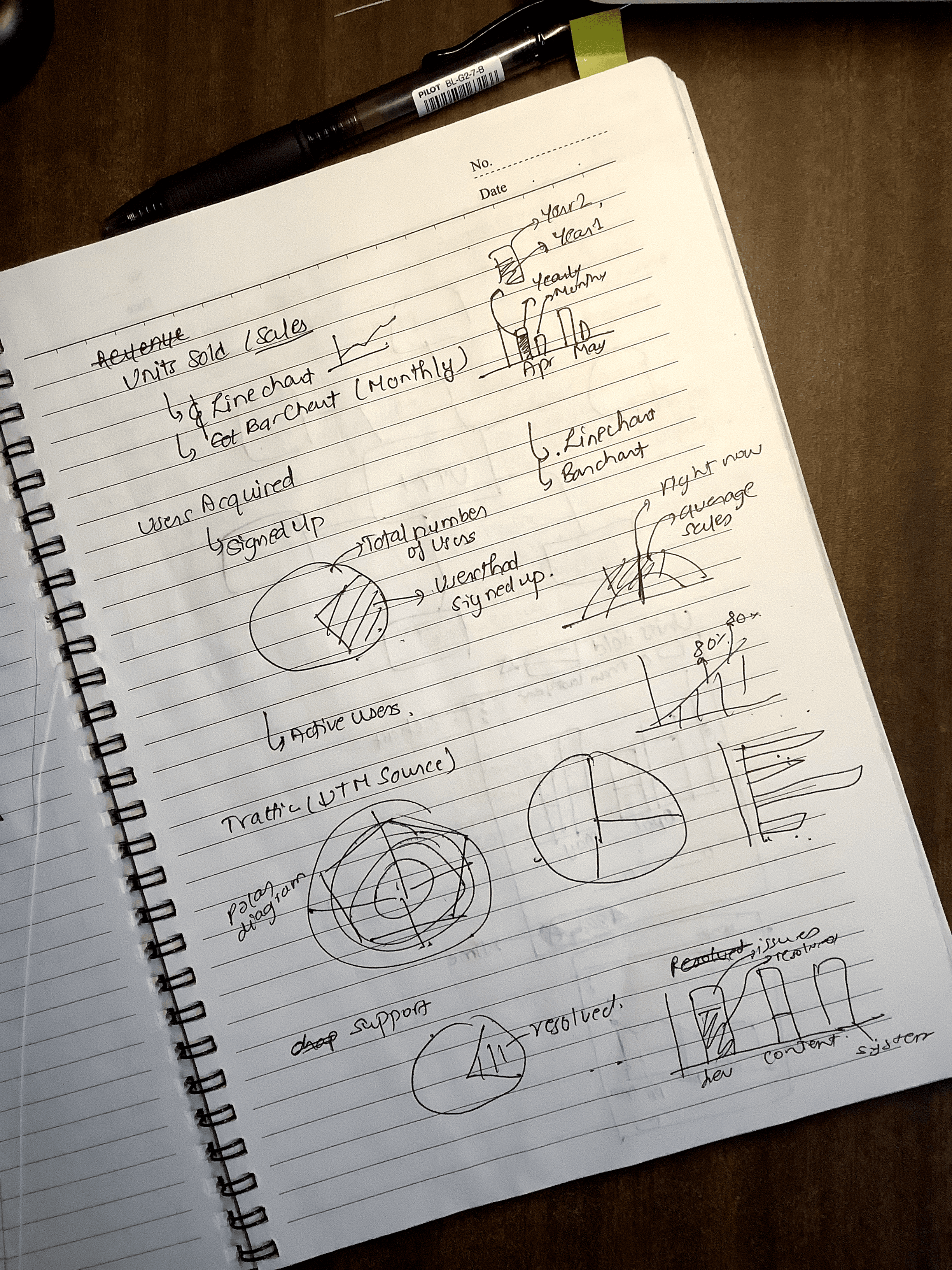
Brain Dump
To begin the ideation process, I started with a brain dump. This involved compiling all the relevant information that could help users understand how Programiz PRO is performing. Additionally, I listed a few KPIs (Key Performance Indicators) that could be relevant to all platform users.

After figuring out what to create, I quickly got started with the digital wireframes and prototypes. Recognizing that any design is incomplete without testing, I proceeded with multiple rounds of user testing and iterations.
The iteration for the final design can be broken down into 3 phases:
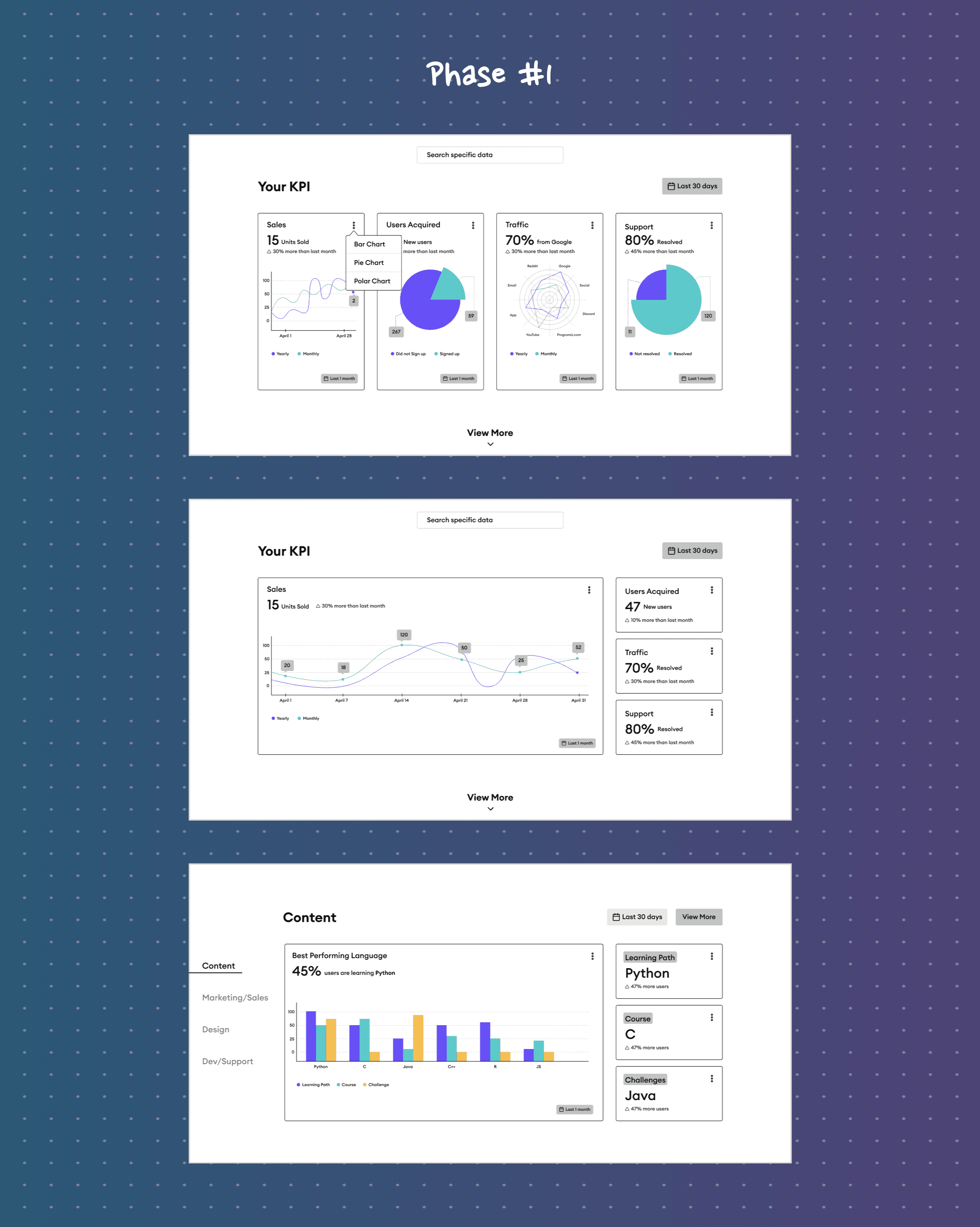
Phase #1
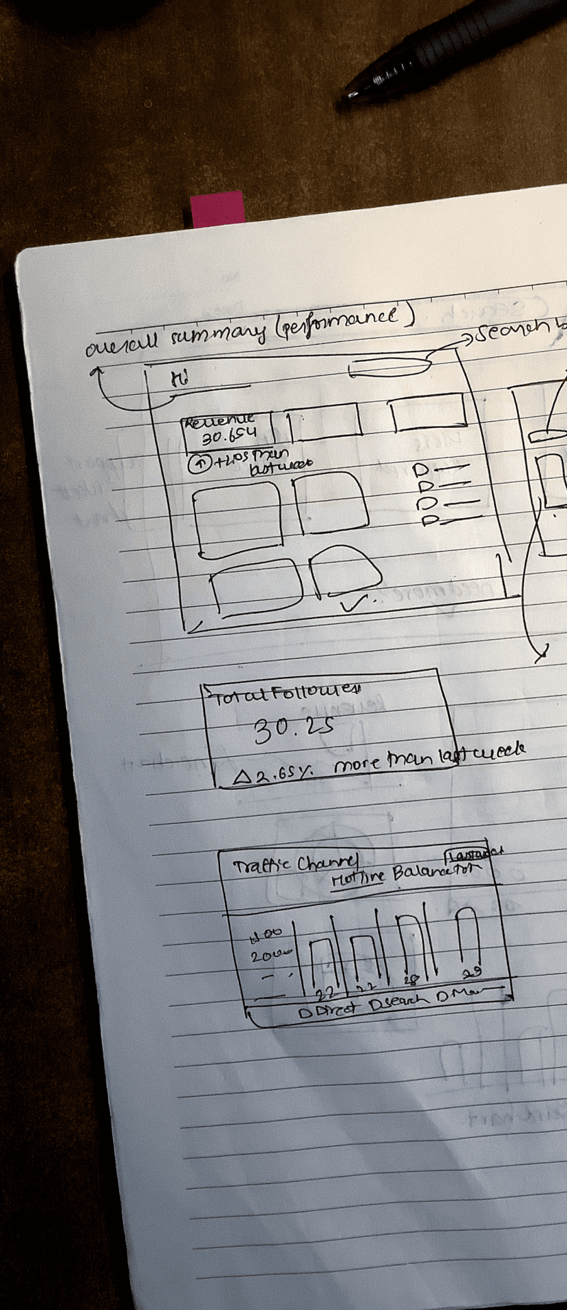
In the initial phase, I opted for a single-page Dashboard that was divided into multiple sections. The hero section would provide a summary of the KPIs, while subsequent sections would offer in-depth analysis of each KPI. However, this idea was soon discarded due to the following reasons:
Including too much information on the screen made it overly complex and not user-friendly, particularly for beginners from diverse backgrounds who utilize PRO Data Dashboard.
Having a large amount of data on a single page could potentially slow down the site, rendering it inaccessible to users with varying computer power and network capabilities.
P.S. Additionally, we desired a screen that could also serve as a screensaver for the Programiz office TV.
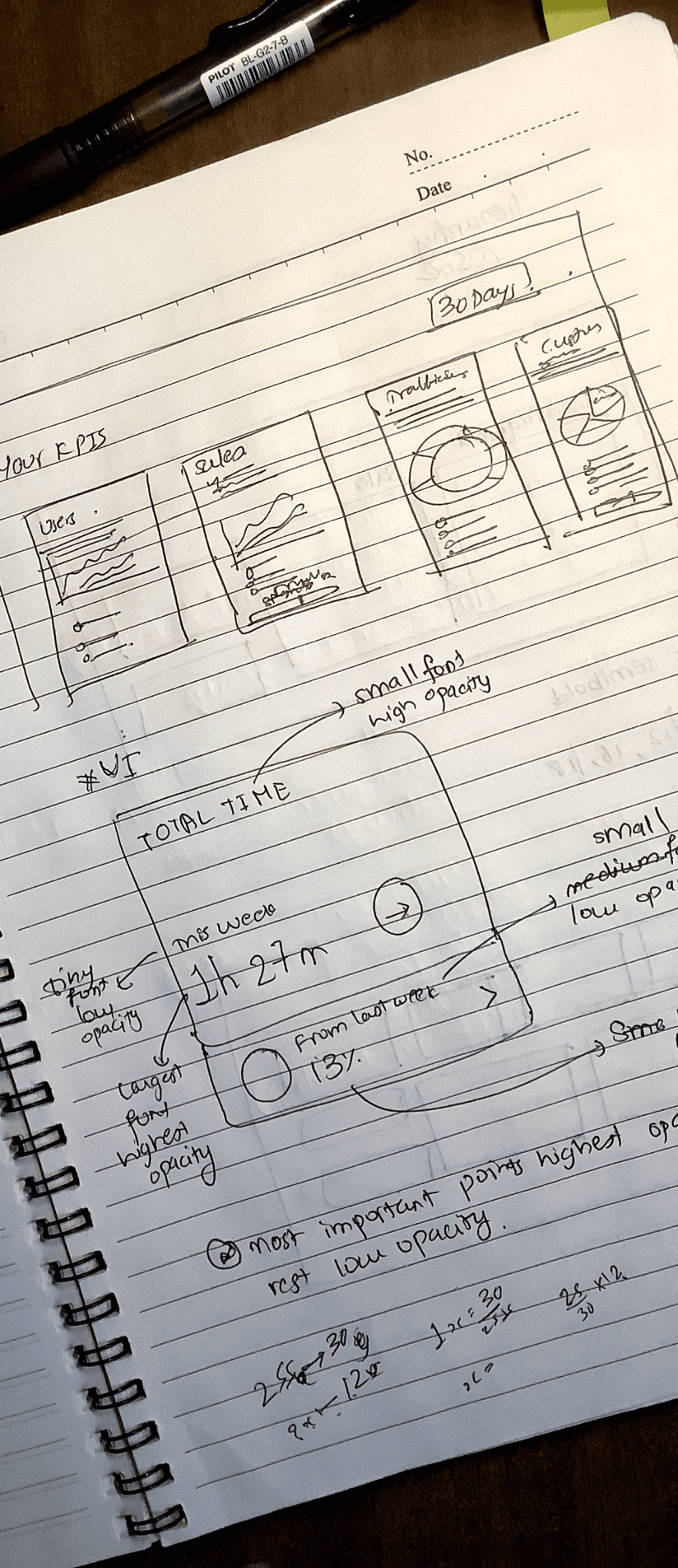
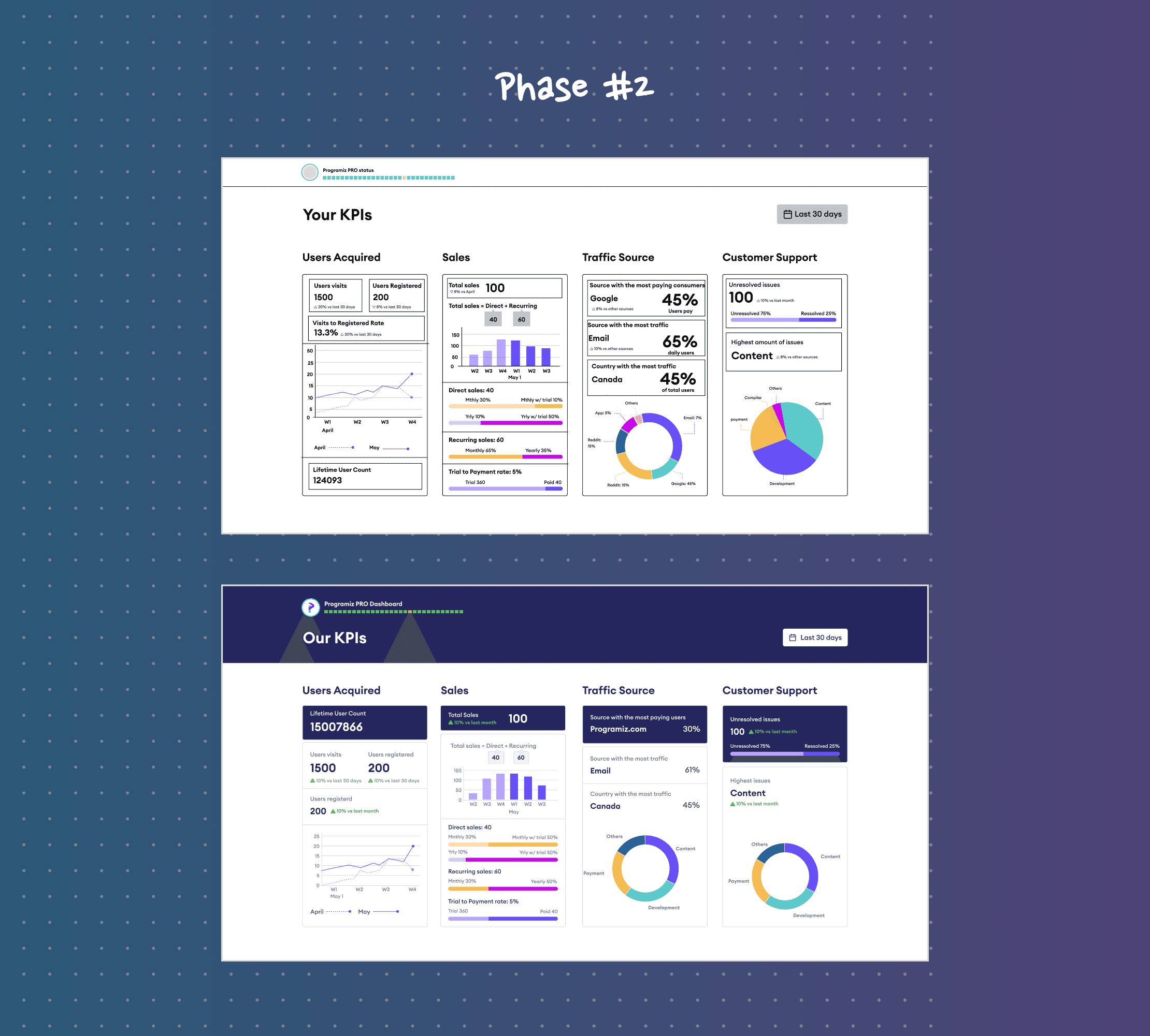
Phase #2
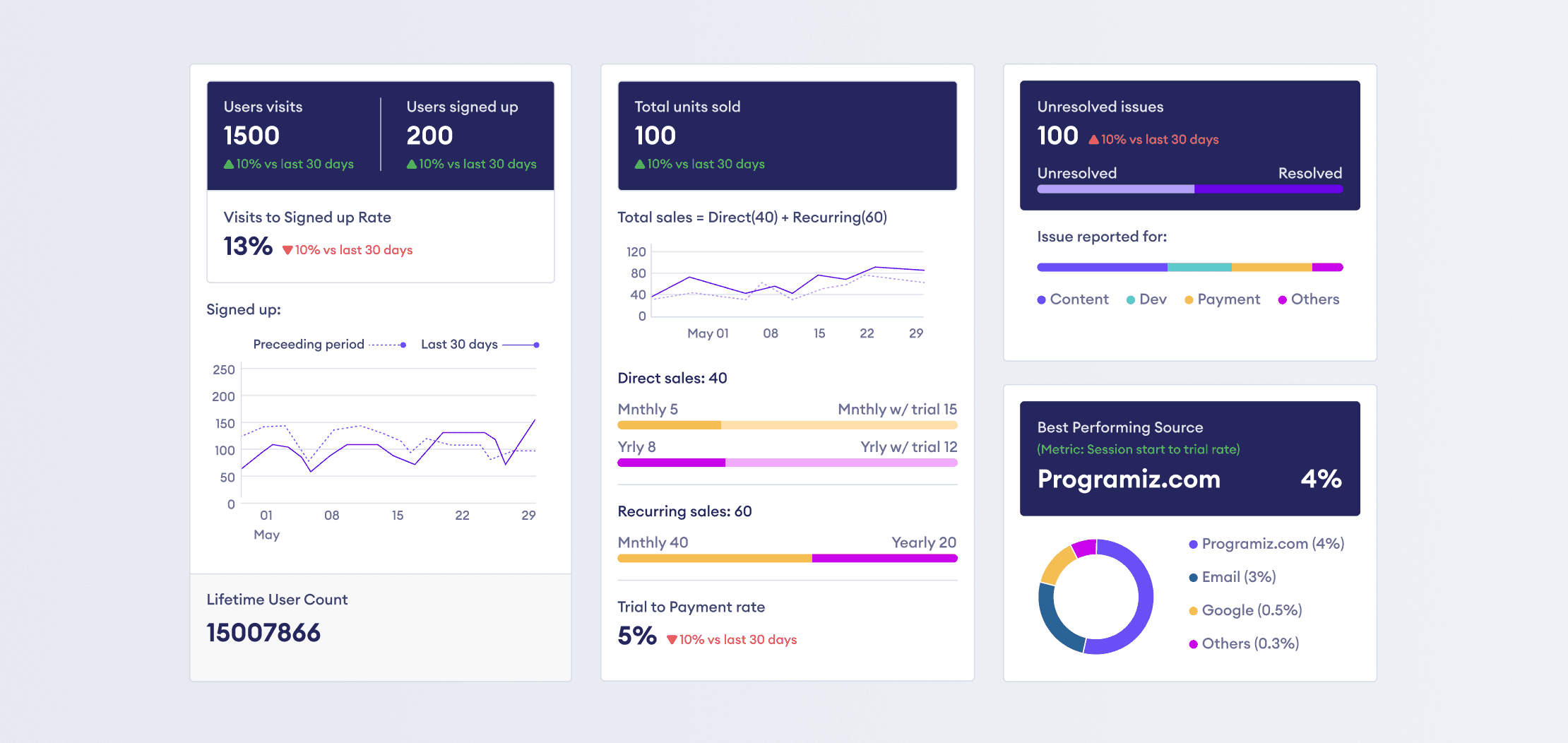
In the second phase, I concentrated on a single main section that highlighted the KPIs defining the performance of Programiz PRO. This phase primarily centered on identifying useful data to represent the KPIs. I also emphasized data representation through graphs and labels.
During user testing, a few issues were identified :
The presence of unnecessary data.
Space allocation for KPIs based on their importance.
Improper data representation for certain datasets.
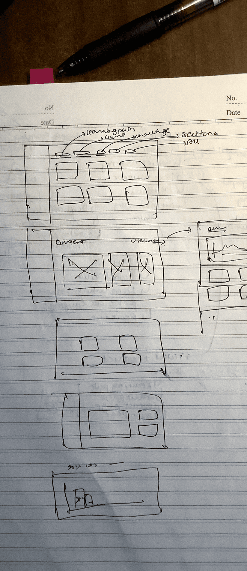
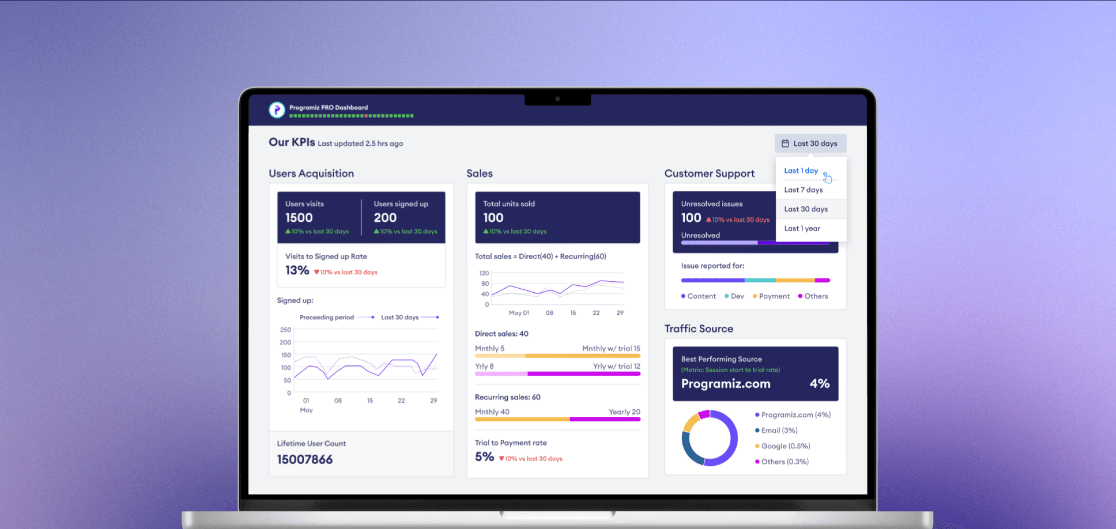
Phase #3 (Final Phase)
After gathering feedback from users, I made several changes to the design, resulting in the final version. Here are some of the modifications:
More space was allocated to important KPIs (User Acquisition & Sales).
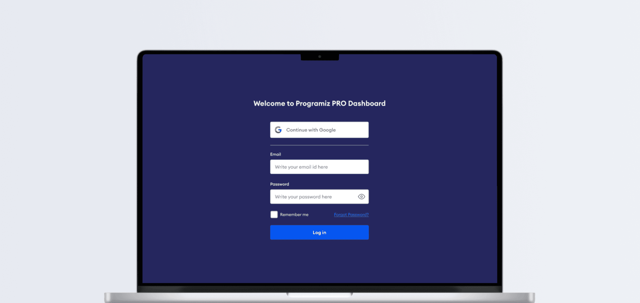
A login page was added, restricting access to those with a company email.
The graphical representation of data was updated.
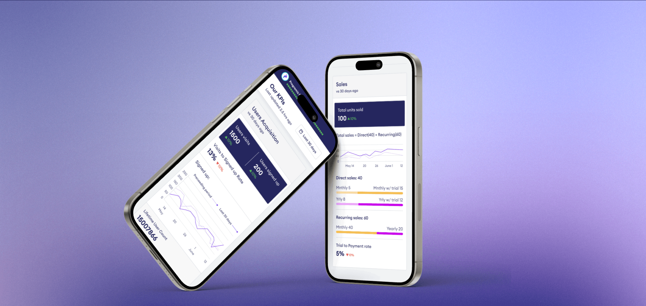
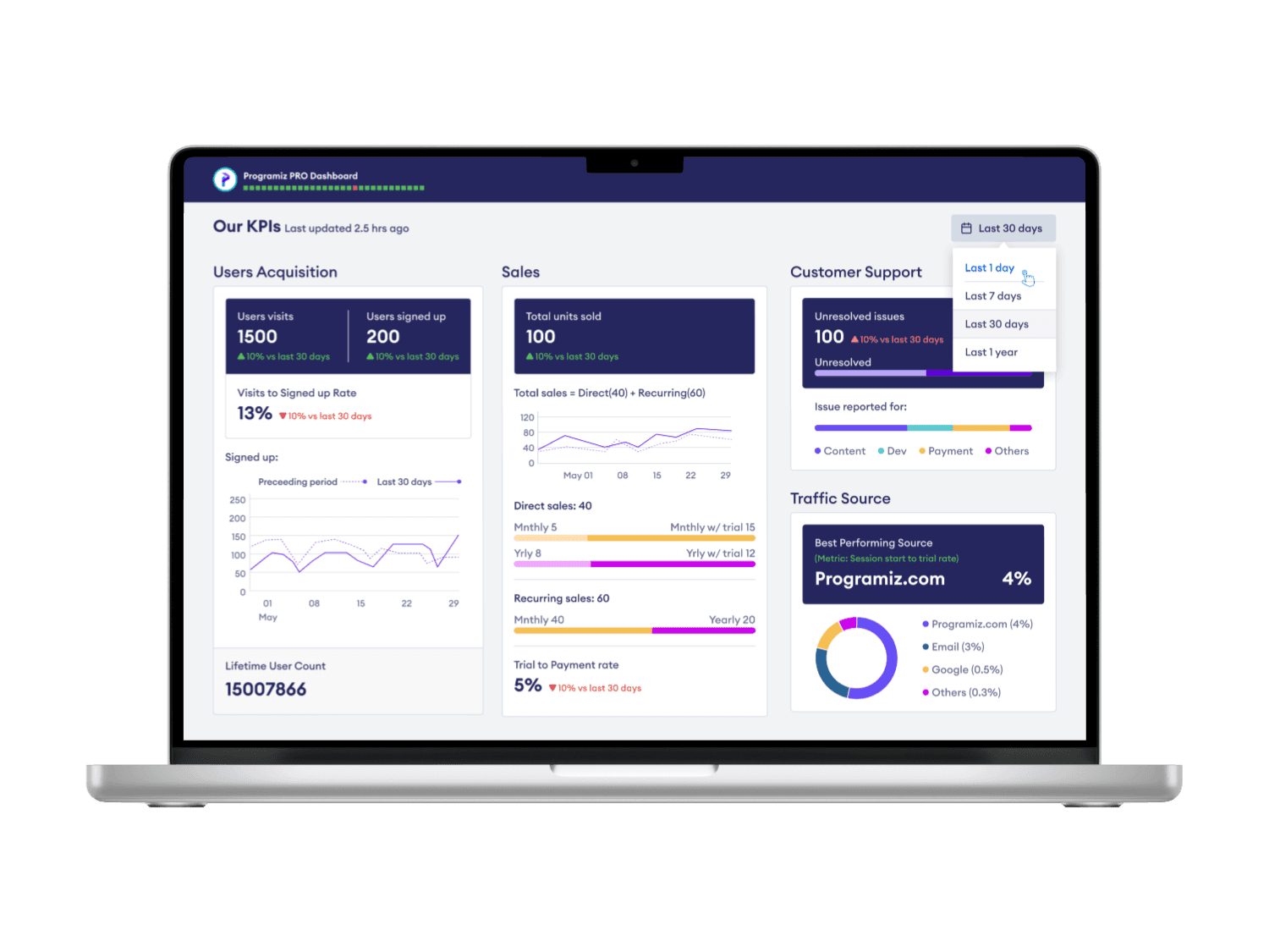
A responsive design was integrated, enabling access from multiple devices.
Every user has a different story:
This dashboard was designed with users from a variety of fields in mind - content, sales, support, design, and more. This diverse user base enabled me to incorporate insights from each perspective, resulting in a product that can benefit all users.
Sunk Cost Fallacy
The term sunk cost fallacy means the phenomenon whereby a person is reluctant to abandon a strategy or course of action because they have invested heavily in it, even when it is clear that abandonment would be more beneficial. Through out this project there have been several instances where I've had to discard processes midway to steer the product in the right direction. This skill enabled me to view the product as a whole and and think about how it will affect the user in the future.

Riya
And that is a wrap!
This project expanded my design perspective in several ways. It provided me with insights on optimal data representation and visualization, and how to compute this data. Furthermore, it allowed me to understand the benefits of such data for users. Throughout the project, I experimented with various data representation techniques and made last-minute changes upon finding superior alternatives. Overall, it was a rewarding experience, and observing the team use the final product was truly enjoyable.
My Role:
UI/UX Designer
Tools
Figma, Google sheets
Duration
APR - JUN 2023

Introduction
Problems
Goal


